DESIGN PRODUCTION
IMPORTANT INFO TO REMEMBER:
TITLE- HIDDEN ASSEMBLE
DATE- 29.04.17
LOCATION- THE SPOT, MANCHESTER
DJ NAMES- KEVIN OVER, BLASHA& ALLART, SAM SULLIVAN& SMOKEY JOE
LOGOS- HA LOGO, SKIDDLE TICKET LOGO


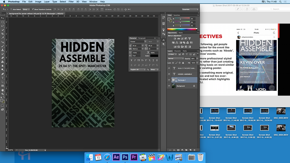
vhs
glitch
The first image is what Sam initially provided me with- a basic logo and the cat eye idea. From this I created a generic poster using a VHS glitch effect tutorial on YouTube to make the poster look more attractive. From the beginning, this type of design concept has always been a favorite, nevertheless I will attempt other ideas because this looked cool but could definitely be improved to give a more professional finish.
To the right is the video I first looked at for guidance. It explained a lot in detail, however, my poster just didn't look good enough so I wanted to continue making other posters with various design concepts.
BLOCK COLOURS
This second poster was created for my presentation right at the beginig of this FMP proect and I actually do like it! I made it very quicklu so if I were to return to it, I would definitely ensure more time to perfect it.
The main learning point from creating this was that it was the first time I downloaded and used alternative PhotoShop paintbrushes rather than the default ones. I got some really entreguing ones of Brusheezy a fabulous, free website and I love the way you can layer the various bruhses to create realistic smoke effects with differing contrast and opacities. I began on a white backgorund as I found was best when researching how to create a poster which I can tell why people use this method as it creates a clean blank canvas to begin desining on.


Also a tip I learnt from Andy I included in this design was the use of caplitalised, italic font. Many years ago the BBC used this method as it suggested how their brand was moving forward and becoming bigger. I also love the way this typography using Impact makes the Hidden Assemble look really dominant and in control while the bright colours contrast still making the poster look fun and intiving.

Final proDuct
ZEBRA

This is an image I took while on set filming. In the club there were walls with random patterns which I thought was so cool.
To make this background, I brought the image into Photoshop and varied the brightness and contrast to make it look less dull and smooth over the sparce patches of paint.


Following this, I then made a font out of my image, once agan using Impact, To do this, I followed this tutorial from River City Graphic, one of my faviorute online teachers. The process is quite simple, all you have to do is find a background, a font and create a clipping mask which sort of creates an outline of the text which is replaced with the image!

ABOVE: My final image font, sticking with Impact and italics, a thin white stroke and drop shadow to add emphasis. I do like this but my only concern is it may be difficult to read from a distance.
Final proDuct
On the same Photoshop brush website, I sourced really cool paint brush textures which I used to highlight the Hidden Assemble title on this poster. I then used white contrasting angled lines to create a frame. In my head I had such a really engaging design, but on paper, this wasn't the case. It is definitely too busy and too difficult to read, although the monochrome concept is quite futuristic, simple yet intriguing.


MORE PAINT


TO THE LEFT: A JPEG version of the background I created using loads of different layers of various paint/ splatter textures.
TO THE RIGHT
This is a JPEG I created on Photoshop with a combination of watercolour and oil paint brushes from Brusheezy. This is to demonstrate how that can be layered, experiencing with opacity and various shapes. I love how the brushes are so different yet compliment each other when mixed. Plus they are royalty free- bonus!

I loved creating this poster as I could be as creative as I wanted and I really did like the finish the different brush strokes gave. In a lot of these types of posters, the design is random and sometimes doesn't have much relevance to the night's title. This is pretty much the same thing, however, the busy, colourful background suggest the event will be fun and lively and quite young. The only thing is, I did't include the date on the poster which is one of the most important aspects to remember! Other than that, I believe everything is clearly presented and the title is the main focus point followed by the logos at the bottom, which if you are a party goer you will recognise these.

Skiddle is an online website to purchase tickets for events

HA- Hidden Assemble brand logo

Void is an audio/ visual hire company
The Spot, M1 6HR, location of party


develo
ping paint idea
For this design, I wanted to continue developing the whole creating my own background idea and infusing this with the use of Photoshop paintbrushes. So do to so, I found a random photo online which I ensured was copy write free. Hidden Assemble to me reminds me of something to do with military. Therefore I wanted to create a khaki themed background, hence why I sourced a predominantly green image with lighter and darker shades.
I then opened this into Photoshop where I put a Gaussian Blur on the image and using a free grey texture image, layered this and reduced its opacity to create a khaki strained background. The reason I put the texture on top was to add definition instead of it simply being a 2D vector.
I then used Impact in around 36px and wrote 'HIDDEN', I then copied and pasted this, free transforming the word and alternating its angles, combined with the word 'ASSEMBLE' to create a jig- saw puzzle. I thought this looked so cool as it was, however this wouldn't be a successful poster as it doesn't contain any information!
TO THE LEFT:
This is the finished background. I think it is quite striking and visually interesting. As I said, it lacks information though and once this was added, I felt like the aesthetics of the poster decreased and it was no longer a success.
I incorporated the use of Photoshop paint brushes on a low opacity to draw attention to relevant information on the poster. The main downside I feel is the font, it isn't harsh or bold enough, although very easy to read.


ABOVE:
Since I preferred the background to the finished poster, I attempted to use Final Cut to produce a moving gif like video to be used as an animated advertisement of the event on Instagram. To achieve this effect I simply imported the finished JPEG onto my timeline and added the Bad TV effect on top. This did look so cool, however would have looked way to cluttered to layer further information. Nevertheless it was great to discover I could edit images on Final Cut to animate them!
photo
shop ft final cut
When I created the moving image in Final Cut, it gave me the best idea to go ahead and make another to experiment and see what the outcome would be. To do this, I placed a random photo taken at the event in Photoshop, added relevant information then imported it into Final Cut. This literally took around 5 minutes to do and I really liked the outcome. Rather than just use a still 2D poster, this is a more interactive method which usually promotes more viewings which leads to an increase in followers. Unfortunately, some of the writing in the poster is slightly too small and would be quite difficult to read. This is still a good starting point and an area I definitely want to develop- animated posters or something similar!

STARTING POINT
This is an image I accidentally took a the club which happens to be light- trails- lucky I didn't delete it.

TO THE RIGHT
I added the same text used in my first design and I do really like this poster, it's simple, conveys all information needed clearly and illustrates a clear message- the poster is a club night held in Manchester. I also used the HA logo as one of the focus points and really like the way the HA font (Times New Roman) contrasts the Impact font- it works well.

fonts used
FINAL VERDICT
Impact has been my go- to font throughout the design process so far as it is clear, easy to read and visually dominating. However, I've grown to love Digital, it's similar but has a bit more character rather than Impact which is just black and white in your face. On the other hand, for the body text font, Digital would too work on a smaller scale, likewise Hussar and Bw Glenn Sans in black would too.

Aliquam- Very suitable for the main body of text eg location and time, clear and with spaced kerning.
Bw Glenn Sans- Way too light but I love 'Black', this would be perfect for the main title.
Digital- My favourite pick for the final poster, chunky but still sleek.
Tex Gyre- Very modern and curved but not as suitable to the VHS theme as other fonts.
Hussar- Similar to Century Gothic, very clean and clear.
IT Encore Sans- Very thick but way too vertically narrow.
League Gothic- Similar to Futura Consended, slightly too narrow could be hard to read.
Impact- Works with every poster so far and has no licences.
ANIMATED AD
I loved the outcome of the previous idea and had to explore this concept further. I love the idea of a poster but to really challenge myself and create a campaign for Hidden Assemble, I need to do more than produce one poster, I need a range of promotional content to really attract new and existing followers.

STEP 1- TITLE
Here I used the 3D effect on Photoshop simply to experiment as I thought it would compliment the VHS Glitch font I downloaded from 1001 Free Fonts. However, I think this looked a little much and made the Sam Sullivan line quite difficult to read but I do like the contrast between the rainbow colours and white font.
STEP 2- DATE AND LOCATION
I stuck to a plain white 2D font to match the previous image. However, this is really primitive and not very eye-catching.

PRESS PLAY
DEVELOPMENT
From the beginning I followed the VHS Glitch idea, so made this, an 80s inspired VHS advert. I first created the images on Photoshop with all essential poster information and then imported this into Final Cut and edited accordingly.
STEP 1- AMENDED VERSION

STEP 2- AMENDED VERSION

STEP 3- PREFERRED VERSION
I re-created the time and date image and much prefer this as I thought it is more important to stress where the venue is- especially as this is an up-and-coming venue in Manchester and so fair quite popular with students and younger clubbers.

final version
I thought the colourful VHS effect was interesting but I never like just leaving it there. I always like to keep experimenting with ideas until I find something that works even better. Once again I produced basic designs on Photoshop and imported into Final Cut. Likewise, to switch this up, I decided to customise my font by using the marquee tool to select different parts of 'Hidden Assemble' then adding the shear tool to add a ripple effect. To create the texture at the bottom, I found a broken TV screen texture on Google and free transformed it and added noise. To create the colourful 3D glitch effect, I copied the Hidden Assemble layer three times and removed the R, G and B levels then slightly moved each layer to the left and right.


PRESS PLAY
To finalise this I used the same audio which can be found on my video production page called 'Distortion'. This really brought the piece to life and by adding the cat eyes, I stuck to Sam's initial brand theme. I added lots of different video effects to bring character to the posters.


glitch poster
I found this really cool image on Google while searching for 'historical face profile'. Raves are usually associated with being crazy and wierd and I thought this photo fit perfectly. I followed the same RGB levels method as in the previous VHS Glitch video but this time using the Wave effect rather than the Shear and using various wavelengths and scales I created the chopped up effect! The different layers look so strange bein bright yellow and blue but to correct this I simply added the screen to the yellow layer and multiply to the blue layer. Lastly, I concluded this design by adding the event's information.
FIRST POSTER
Since the pink was a dominant colour in the image, I went back to my Photshop brushes and painted these with different opacities to create text boxes for the text which I thought complimented the whole painted theme.
SECOND POSTER
This poster is more modern and focused on the design than the first. When designing my posters, I liked the idea of using Bauhaus as inspiration so here, I selected around the man and copied and pasted onto a background I created by drawing rectangles on a white page and adjusting the angles and colours. I then used the paint brush tool on the airbrush mode to spray paint around this. I used the eyedropper tool to source the same colours as used on the man. I really liked this, however like the previous one but when speaking to Jill, realised I couldn't use this as the image wasn't copy right free!

DEVE
LOP
MENT
For this poster I used the same method as before but on my own photography. When I hired the camera from Mollie, I took a couple of photos which I then edited and created the poster above. This poster was just for fun and to work with contrasting colours. To create the poster I edited the photo of Sam, added a white rectangle and transformed this onto an angle then used ***** font . To create the split effect, I typed Hidden Assemble, adjusted the kerning then copied this, erasing part of the top layer (the bottom Hidden Assemble).

Finished edited photo


Another action shot which could be used on the Hidden Assemble Instagram page for promotions. Here I used the lens blur tool and adjusted this to create a customised field blur and edited the sharpness, brightness and contrast to achieve my designed effect.
the final poster
Designing so many posters on one hand has been so time consuming, whereas, it has also really helped me to realised what works and what doesn't. I've sent all posters to Sam throughout this journey to get his input and all he ever says is it looks good so I had to turn to teachers to get honest feedback in order to create my final poster as I feel I'm not quite there yet.
This feedback form has been a great way to get people from various age groups to give their input. I went back and adjusted my questionnaire as I did mix up the age ranges which was a total typo and am following up on Rebecca and Mollie's advice to stick to the theme for the poster.
Please open this gallery to enlarge the screenshots. There were so many brush options to choose from! This is a sample.


Small Heading

Although I initially loved the idea of smoke floating accross the page, I think I prefer the powder ones only for the fact that the event is called Hidden Assemble and the idea of assembling is coming together. Additionaly, I believe that the cluster of poweder to be placed in the middle of the page resembles this more than the smoke.
This tutorial by TutVid was undeniably helpful when it came to creating the final poster as I wanted to go for the 3D feel as if the cloud was trying to jump out of the frame.
To produce this poster I began with a black canvas in comparison to a white one. I know this was recommended by poster experts, however, I loved the simplicity and style my previous saturated poster portrayed and really felt this would fit much better to my promotional theme.
I then sourced 'Powder 16' from my favourite royalty free website, Brusheezy. On the other hand, I also loved the flow that the smoke brushes from my first ever design gave. Therefore, I created two basic posters with the box idea (to give a minimalist yet sleek feel, like a photoframe in which the cloud or smoke would appear to be popping out of). The smoke brushes were also from Brusheezy, I used a comination of smoke 13, 14 and 15 in the experiment design but opted for smoke 14 in the final design as they looked much more realistic and the shape flowed really well across the page. To the left is a comparison of each brush style.
ALTERNATIVE POSTER

PHOTOSHOP STEP BY STEP


STEP ONE
I opened Photshop and set the preset to international paper at A4. Since my image will be a vector, even if it's stretched to A1 for a wall poster or even scaled down to A6 for a flyer, the graphics won't be affected.
STEP TWO
I used the paint bucket tool to fill the background as a black colour with opacity set to 100.
STEP THREE
After adding a new layer, I sourced my powder brushes and using a light grey colour, not quite white, I painted my central design onto the page, layering and adjusting opactiy accordingly.
STEP FOUR
I used the rectangle shape tool with a thick stroke to create the cloud's border. I then followed this by adding the VHS glitch- unfortuanetly this didn't look right, the red and blue 3D effect was too much and took away from the simplicity of the cloud, although I loved the effect on the cloud- pretty annoying! To create the glitch effect, I used the exact same method I explained on the previous poster of the portrait painting of the man, this time without sheering the image.
STEP FIVE
Since the previous step didn't work, I undone my work and deleted the rectangle. I then adjusted the RGB layers and levels, slightly moving each copied layer to the left and right to reveal the glitched 3D effect.
STEP SIX
I then added a new layer and the rectangle on top of the cloud.
STEP SEVEN
To add the bad TV texture to the cloud, used this layer and went onto the filter gallery, and then onto the sketch options, followed by Halftone, setting the pattern type to line at around 9.
STEP EIGHT
Using Digital, I added the date onto the top half of the poster at 85pt as I wanted this to be the centre of attention, followed by 'Hidden Assemble Presents' in Raleway at 19pt and chose italic because as I earlier learned, italic typography suggests the brand is moving forwards.
STEP NINE
Using Digital at a much smaller scale than the date and also adjusting the verticle scale to squeeze and stretch the font, I fit the DJs names on to the page horizontally. The names luckily just fit in; since Kevin Over is the speical DJ, his name had to be slightly larger. To space these out and make the poster clearer, I added a simple white thin line.
STEP TEN
I then added the logos at the bottom of the page and had to use the paint bucket tool to fill these with a block white colour. This is because I coped them from the paint splatter poster and on here, the colour of the logos was a light grey.
STEP ELEVEN
Once again using Digital, I added the final bits of information for instance the time and location. Using the italic Bw Glenn Sans, I added the DJs record label names.
THE
FINISHED PRODUCT
